


Weekly S&P500 ChartStorm - 7 April 2024 [Free Version]
This week: macro risk outlook, CEOs and buybacks, supply and demand, energy stocks, who owns stocks, where do returns come from, stocks vs commodities...

Welcome to the latest Weekly S&P500 #ChartStorm! [free version] — the Weekly ChartStorm is an easily digestible selection of charts which I hand pick from around the web +my own files. These charts focus on the S&P500 (US equities) with a particular emphasis on the forces and factors that influence the outlook, to bring you insight and perspective.
Highlights + key points from this week’s charts:
The macro is not market friendly as geopolitical risk boils over and higher-for-longer risk comes back into focus.
Buybacks are set to rise as CEO confidence rebounds.
Energy stocks are breaking out, and allocations to the sector are light.
Older people own a greater share of stocks (while 40-54yr olds get squeezed).
Stocks are expensive, commodities are cheap.
MarketCharts.com — Tools for Traders and Investors
This service is one of my favorite go-to resources for exploring the markets. I especially value their breadth charts and ease of navigation — you can quickly check through multiple indicators to get a sense of the market outlook.
I reckon it’s good value for money +they offer a free trial for new accounts.
Find market edges with the web's largest market breadth library.
Develop new signals using subindicators, derived from other indicators.
Rapidly backtest your ideas or simulate strategies without any coding.
Find signals with live scanning or get intraday alerts using your criteria.
Subscribe monthly, or yearly to get 2 months free. Cancel online anytime.
1. Risk Check: I’ve recently noted the complacency in risk pricing set against the backdrop of rising (geo)political risk and reacceleration/resurgence risk. Last week was a shot across the bow on both fronts. The strong jobs data + PMI readings along with rising oil prices have reduced the likelihood, speed, and magnitude of any Fed rate cuts. Meanwhile geopolitical risk is bubbling over as Iran looks to respond to the Israeli airstrikes on its Syrian embassy early last week.
As always, markets know, and the key things to track will be oil/energy stocks and bonds (and the chart below shows them heading in the wrong direction*).
Here’s the short-term predicament: if geopolitical risk boils over into a larger Middle East conflict, that sends oil prices up, risk off. If nothing major happens then bonds likely selloff as resurgence risk and higher-for-longer narratives come into focus. Macro is not market friendly at the minute..

Source: @Callum_Thomas using StockCharts
2. Less Bad Though: Having said that, reacceleration risk comes against a backdrop of recession averted and at least expectations of rate cuts. This has helped bolster CEO confidence. And interestingly enough, it seems when CEOs are confident they do more stock buybacks.

Source: @ISABELNET_SA
3. Supply & Demand: One thing to remember amid all the variables and calculations and prognostications on the stockmarket… is that it is after all, a market. And what does ECON101 tell us about markets? Price is the balancing factor between supply and demand. The chart below shows what’s been happening on the supply side of the equation (in other words: more buybacks and less IPOs/issuance = shrinking supply, shrinking supply ceteris paribus = higher prices).

Source: @C_Barraud
4. Energetic Hedge: Over the time period in the chart below, the market cap weight of energy stocks has been inversely correlated with overall stockmarket PE ratios. This reflects that fact that energy stocks tend to do well when oil prices go up, and when oil prices go up — generally speaking so does inflation and interest rates (and that tends to push down valuations one way or another). The takeaway is that energy stocks can be thought of as a defensive/hedge.

Source: @LizAnnSonders via Daily Chartbook
Reminder: Subscribe to the [Free] Chart Of The Week
Gain access to original macro market charts + insights from
5. Low Energy Hedge Funds: Interesting follow-on, hedge funds are running fairly light allocations to energy stocks (they are probably all-in on tech stocks/Nvidia — as sometimes you just have to go with the momentum flow). By my metrics, retail is also fairly light on energy stocks, so if energy stocks really get going it could see a bit of chasing and band-wagoning.

Source: @OilHeadlineNews via @Josh_Young_1
6. High Energy Stocks: And, well, energy stocks are making a break for it. And it’s worth noting that energy stocks had already begun their breakout *before* the Israeli airstrikes on Iran’s embassy (and breadth had already been steadily pushing higher). So this one may have legs even if things pan out OK on the geopolitics front. Afterall, global crude oil demand continues to tick higher…

Source: MarketCharts — useful charts, indicators, data, and more… [links to the specific chart above, which you can add to your own custom chart-library when you sign up for an account with MarketCharts.com]
7. Who Owns Stocks: Switching gears, this is an interesting chart. We should probably expect the red part to go up as life expectancy goes up (went from about 75yrs to almost 80yrs over that period — that’s about 5 more years of compounding!). The younger crowd made a bit of a comeback as the pandemic stimulus made stocks cool again. But the 40-54 years cohort has been squeezed the most — perhaps due to rising house prices meaning mortgage payments take priority over saving and investing (maybe also people having kids later in life).

Source: @KobeissiLetter
8. Where’d You Get Those Returns From? Over the long run most of the returns come from earnings growth, while dividends have tended to provide the most stable component of returns, and contribution from valuation changes gyrate significantly. If you catch the wrong part of the cycle then earnings growth will be a detractor, if you get in with high starting point valuations you might take a hit on valuations in the future, meanwhile dividends ain’t what they used to be. Important to be cycle and value aware to maximize returns.

Source: @DividendGrowth
9. Best Stocks in 30 Years: This table is interesting for a few reasons, it shows the benefit of picking the right stock or small concentrated group of winners e.g. if you had just bought $10k of Amazon when it IPO’d. But it also raises the point that if you did buy $10k of Amazon at IPO, you probably would have sold when it doubled to $20k, or bailed out when it dropped 90% in the dot com crash. Very few would have held all the way, and even if they did, if they didn’t sell along the way they probably aren’t selling now either. It also ignores the many that delisted/merged/zero’d.
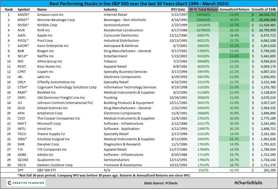
Source: @charliebilello
10. Nasdaq vs Commodities: I’ve seen this chart appear a few times recently and with a few variations, main point is though that tech stocks appear stretched relative to commodities. Some take the leap to say that commodities are cheap and/or tech stocks are expensive based on this chart.
Now, relative price series like this are highly useful — they represent basically a synthetic asset (e.g. in this case long tech, short commodities), and can sometimes yield important insights as an analytical series. But they are not valuation indicators — for that we need to look at the bonus chart section…

Source: @TaviCosta
BONUS CHART SECTION…
Commodities vs Stocks (upgrade to paid to access)
Paid Subscriber Benefits:
Access to the Bonus Chart section (exclusive chart/theme/insight)
Access/Participation in the Comments Section (paid subscribers only)
Have your Questions Answered (by email or in the comments)
Quick+Responsive Customer Service (no issues unresolved)
Ad-free (no ads in the way, no marketing emails)
Upgrade to paid for instant access to these benefits — Gain a greater level of insight, join a community of intelligent investors, and support the cause!
Thanks and best regards,
Callum Thomas
Founder & Editor of The Weekly ChartStorm
Twitter: https://twitter.com/Callum_Thomas
LinkedIn: https://www.linkedin.com/in/callum-thomas-4990063/