


Weekly S&P500 ChartStorm - 20 April 2025
This week: technical check, death cross fact and fiction, market indicator notes, gold vs stocks, retail buy the dip, bear market regimes, and rethinking the bull case...

Welcome to the latest Weekly S&P500 #ChartStorm!
Learnings and conclusions from this week’s charts:
The death cross is both more AND less useful than most think.
Trend change indicators are more important if context confirms.
Current context (valuations, macro) confirm caution is correct.
We’ve seen heavy dip-buying behavior.
There is a bull case to be made, but a lot needs to go right (/less wrong).
Overall, without getting too bogged down in the death-cross-debate it does provide a prompt to have a think about indicator design and selection, as well as investment process and strategy approach in general. But in terms of how things are sitting, clearly with multiple indicators and data points saying be careful we’d be silly not to head that cause for caution. And yet, there is a bull case to be made…
n.b. check out the new “Getting Started” section (how to make the most of your subscription to the Weekly ChartStorm + troubleshooting), and Reviews & Testimonials page (further feedback always welcome).
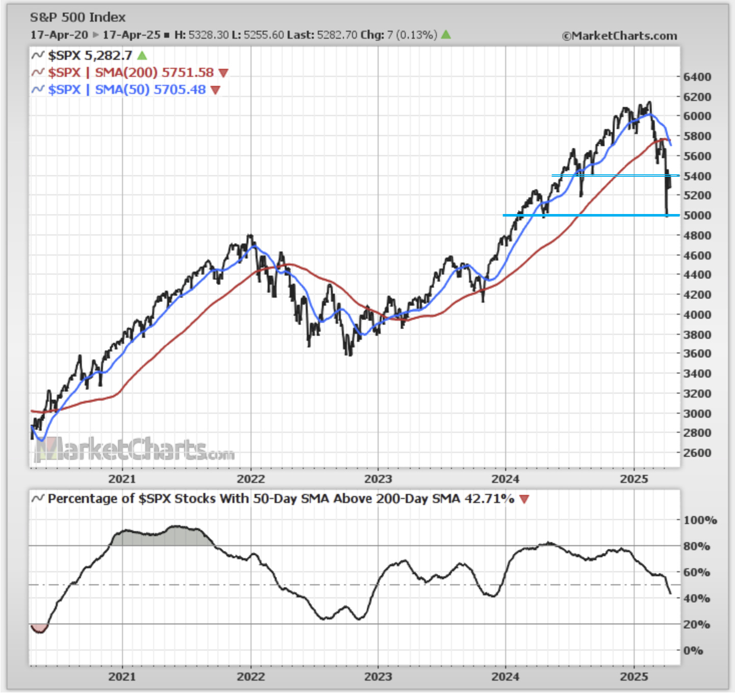
1. Debating Death Crosses: You might have seen some of the chatter around the “death cross” (the 50-day moving average going below the 200-day average), and indeed one has triggered. But first: what is the purpose of the death cross? Basically it is supposed to help tell us about the trend (+changes in trend) — specifically it is supposed to give a less noisy (but later) signal vs just a price vs 200-day moving average crossover (e.g. early-2022 saw the index drop below the 200dma, go back above, go back below, back above, and then below for longer; while the death cross only triggered once).
So it gives us a lower chance of getting a false signal, but at the cost of only triggering later in the process (and this year’s price action shows how during rapid declines it is not ideal at all given how late it activates).
Curiously though, the *breadth* of 50 vs 200dma for S&P500 members did provide early warning signals by trending lower vs the index ticking higher (a classic bearish divergence). It did a similar thing in 2021 prior to the 2022 bear.
Source: MarketCharts (by
)2. The Thing About Death Crosses: But let’s take a look further back in time; clearly this indicator is not perfect (and p.s. I have yet to find any indicator that is!), but the key point is that this indicator should heighten the senses… as Rob Hanna astutely notes: “36 of the 49 instances (73.5%) actually saw the SPX realize gains while the Death Cross was in effect. The problem is the losing trades were very large. And even most of the winners saw a sizable round-trip lower before they were able to carve out some gains (like the last one in 2022).”
In other words, it would be wrong to ignore trend indicators, especially when they are turning down, but as with any indicator —it would also be wrong to rely to heavily on it and without bringing in some wider context.
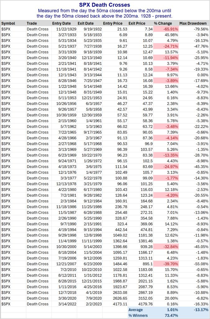
Source: @QuantifiablEdgs
3. One Piece of Context — The Worst Chart: And here’s one concerning piece of context; we are coming from a point of one of the highest ever average valuation score for US assets… at a time when you have an upshift in (geo)political risk and rising odds of recession. So with that wider context you would tend to give trend indicators a bit more weight if price along with value/macro are all telling you the same thing (to be a bit more careful and wary of larger downside risk).
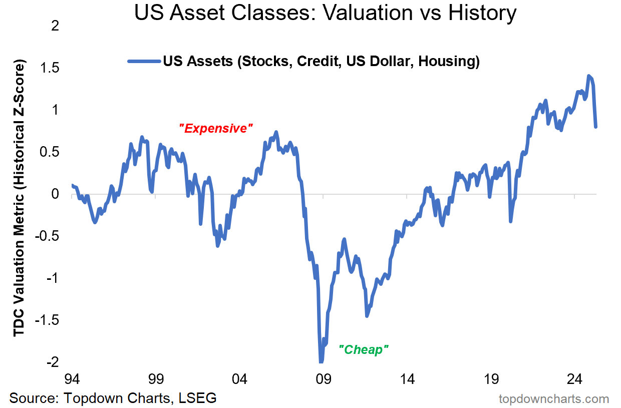
Source: Chart of the Week - The Worst Chart
4. Indicator Imperfection: And another thing, on indicator imperfection, this may be a perfect example… Surges in margin debt growth coincided with 3 major market peaks over the past 3 decades —but also happened about at least as many times without consequence. Plunges in the indicator were a bit more reliable, but then again with an asset that trends up over time; bottom picking indicators are always going to work better than top picking indicators. So there’s a few things to learn and ponder in there. In the immediate term though this one is also saying be careful.
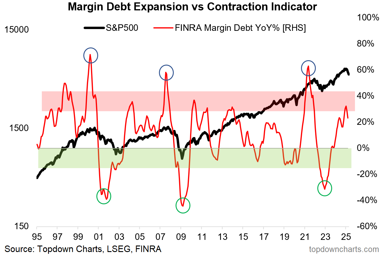
Source:
5. Interacting with the Market: Meanwhile, March saw a record high in new account openings for Interactive Brokers. To be fair, maybe some of this was people opening accounts to try and short the market…
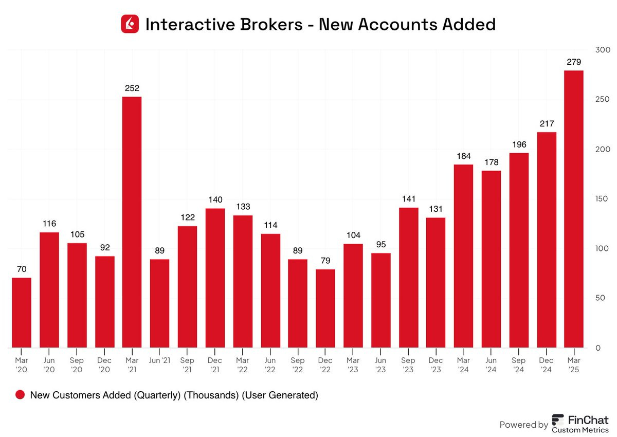
Source: @finchat_io
6. Leveraged Long the Dip: In practice, we just saw one of the most heroic surges in dip-buying in recorded history. Trading in leveraged long US equity ETFs surged to a record high last week. Albeit, we did also see this indicator surge around the 2021 peak and decline into 2022 bear.
Keep reading with a 7-day free trial
Subscribe to The Weekly ChartStorm to keep reading this post and get 7 days of free access to the full post archives.