


Weekly S&P500 ChartStorm - 16 July 2023
This week: sentiment, flows, stocks vs bonds, put/call, forecasts, arc of ARKK, inventories, valuations, tech stocks, and global cyclicals vs defensives...

Welcome to the latest Weekly S&P500 #ChartStorm!
Learnings and conclusions from this week’s charts:
To the question “is sentiment better because price is higher, or is price higher because sentiment is better?” the answer is ‘yes’.
Sentiment/allocations/flows/options trading activity shows bullish enthusiasm stoking brighter as consensus shifts outright bullish.
Valuations are increasingly stretched expensive for tech stocks and growth vs value stocks.
ARKK is attempting a comeback after a big boom-bust cycle.
Global cyclicals vs defensives are stirring after slumber.
Overall, the market seems to be flying closer and closer to the sun with sentiment really heating up now, valuations reaching renewed extremes, and a steady if reluctant shift in consensus as price pushes higher.
1. Chicken & Egg: This one is a bit of a chicken vs egg situation, where you could ask: is sentiment better because price is higher, or is price higher because sentiment is better? The answer, as with many of these types of questions, is basically “yes“. Nothing changes sentiment faster than price, but also, when you have the crowd collectively changing their mind it moves markets. So the path in price from October to now can be traced also in the path of sentiment.

Source: @WillieDelwiche
2. Go With the Flow: Keeping with that theme, this chart basically shows you a case study in capitulation, as the wall of worry of much of H1 got cleared and FOMO drag-along flows lit up.

Source: @ISABELNET_SA via @SpecialSitsNews
3. Stocks vs Bonds: Echoing on from the first chart, it’s interesting to note this chart alongside the observation that bonds are basically flat YTD, while stocks are up solid double-digits. Now that the crowd firmly favors stocks over bonds, the open question is: will H2 “echo” or “mirror” H1 for stocks vs bonds? (if you ask me, I would tell you all the evidence I look at says mirror: stocks are overbought, bonds are oversold).
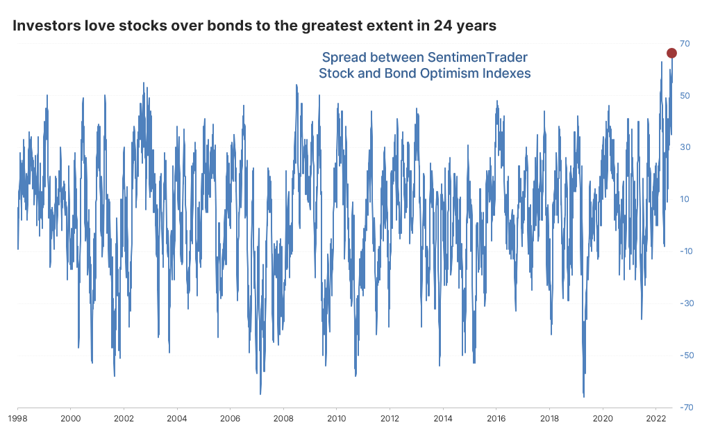
Source: @jasongoepfert via
4. Put it this way: As sentiment has recovered, so too has interest in trading call options (bullish bets), and hence the put/call ratio has dropped back to the bottom of the range — which outside of regimes where the Fed is pumping stimulus (e.g. the 2020/21 period) typically indicates elevated downside risk. Basically it’s a contrarian sentiment indicator.

Source: McClellan Financial Publications
5. 1-Down on Wall Street: Seems strategists are very bearish on equities in H2 based on the average year-end S&P 500 index price target. But it’s also interesting to note that the gap between the most bullish vs bearish price target is at historical extremes. So I would say the story of H2 is far from written at this point.

Source: @Barchart
6. The Arc of ARKK: Perhaps the most widely talked about actively managed ETF in recent years is back in the conversation as the price of ARKK 0.00%↑ is making an attempt at breaking out through a key resistance level. After a big boom and bust cycle, is the next step in the arc of ARKK a big comeback?

Source: @HostileCharts via @TheChartReport
7. Taking Inventory: Through the macro gyrations of covid, firms basically went from a situation of not enough inventory to too much as they pivoted from “just in time” inventory management to “just in case”. Now as demand has softened, firms are attempting to run down inventories.
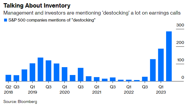
Source: @chrismbryant
8. Valuations — Tech Sector: Tech stocks are not cheap.

Source: @GameofTrades_
9. Valuations — Growth vs Value: Investors are apparently willing to pay more than 3x the valuation for growth stocks vs value stocks — this premium is significantly elevated vs history (over twice that of the long-term average). When sentiment is increasingly consensus bullish, valuations are stretched expensive, and monetary conditions are increasingly tight, it makes for a precarious path.

Source: Norbert Keimling
10. What’s Your Contribution? This is a very interesting juxtaposition, and similar to a chart I shared recently, it shows the market cap weighting of the 10 largest stocks… vs the earnings contribution of the same group. Seems they’re not really pulling their weight.
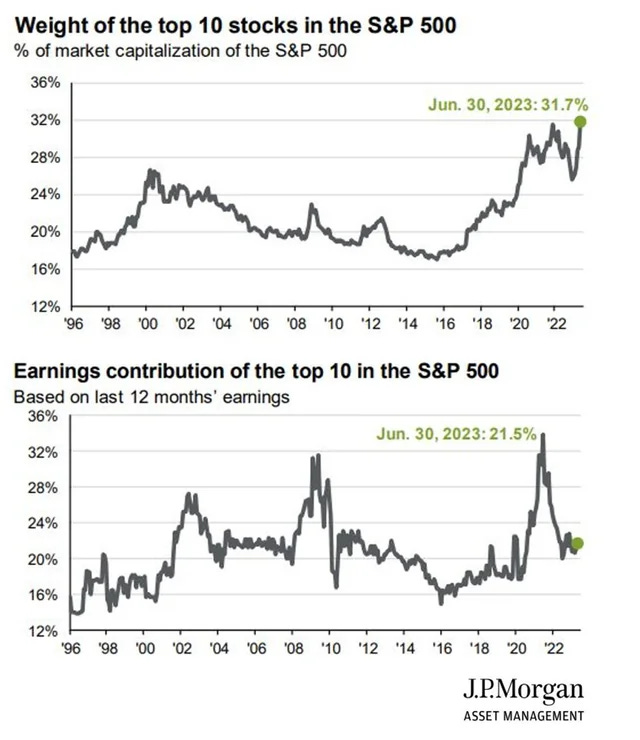
Source: @Mayhem4Markets
Thanks for reading, I appreciate your support! Please feel welcome to share this with friends and colleagues — referrals are most welcome :-)
BONUS CHART >> got to include a goody for the goodies who subscribed.
Cyclicals vs Defensives: I thought this one was interesting because it shows US cyclicals vs defensives clearly making a sharp breakout vs resistance during June. By itself that is an interesting development (cyclicals tend to outperform defensives in a bull market and economic expansion).
But also of interest, after a long period of down-trend, Emerging Markets and EAFE (Europe, Australasia, and the Far East — developed markets) now also appear to be in the early stages of breaking out…
Keep reading with a 7-day free trial
Subscribe to The Weekly ChartStorm to keep reading this post and get 7 days of free access to the full post archives.